CSS Interview Questions 2026: Selectors, Layout and Responsive Design with Visual Answers
Prepare the CSS questions freshers repeatedly face, with calculated specificity, box-model arithmetic, centering patterns and responsive-layout decisions.
KnowledgeGate Team
Exam prep & CS education
Updated 11 Aug 20266 min read252 views
CSS questions can look softer than DSA, so freshers often leave them for the last evening. Then the interviewer asks which selector wins, why a 200 px box renders at 240 px, or how to centre a child on both axes. These are not opinion questions. They have mechanical rules and answers you can work out. Learn those rules once, and the follow-up questions become much easier.
The three areas every CSS round hits
Most fresher rounds sample three connected areas:
selectors, the cascade and specificity, which decide which declaration wins
layout, including the box model, positioning, flexbox and grid
responsive design, including media queries, relative units and mobile-first structure
An interviewer may ask for a definition, then immediately turn it into a visual task. For example, "What is flexbox?" can become "Centre this card". "What is specificity?" can become "Which colour appears and why?" Your answer should name the rule, calculate or trace it, and then show the smallest correct code.
If HTML foundations are also part of your round, HTML interview questions for freshers covers semantic tags, form payloads, native validation and the attributes interviewers keep returning to.
Selectors and specificity, calculated
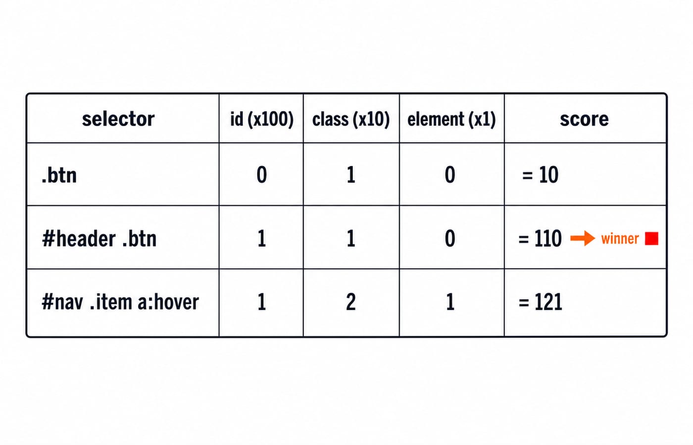
Specificity is commonly written as a tuple (id, class, element). IDs fill the first position, classes, attributes and pseudo-classes fill the second, and elements and pseudo-elements fill the third. The 100, 10 and 1 score is a convenient interview shorthand for ordinary examples, while the tuple is the safer model because the positions are compared from left to right.
Take these rules:
.btn { color: blue; }
#header .btn { color: red; }
.btn contains zero IDs, one class and zero elements. Its tuple is (0,1,0), or 10 by the shorthand.
#header .btn contains one ID, one class and zero elements. Its tuple is (1,1,0), or 110. Since (1,1,0) outranks (0,1,0), the text is red when both selectors match. Writing the .btn rule later does not help it, because source order breaks a tie only after origin, importance, layer and specificity have been resolved.
Now count #nav .item a:hover:
#nav: one ID, contributing(1,0,0).itemand:hover: two class-level selectors, contributing(0,2,0)a: one element, contributing(0,0,1)
The total is (1,2,1), or 121 by the shorthand. Count the pseudo-class :hover in the class column, not the element column.
Inline styles sit ahead of the ID column, which is why some references write specificity as a four-part tuple, (inline, id, class, element). !important changes the importance level rather than adding points to the selector, so color: blue !important on .btn would beat the ordinary red from #header .btn despite the weaker score. When two important declarations compete, specificity decides between them and source order settles any remaining tie. CSS specificity and the cascade walks that full resolution order through a single paragraph, adding one declaration at a time until an important rule takes over.
The box model and box-sizing
Every rendered box has content, padding, border and margin. With the default box-sizing: content-box, the declared width applies only to the content.
Consider:
.card {
  width: 200px;
  padding: 20px;
}
There is 200 px of content width, 20 px left padding and 20 px right padding. With no border, the rendered outer width before margin is 200 + 20 + 20 = 240 px.
Now add box-sizing: border-box. The declared 200 px includes the horizontal padding and any border. With the same padding and no border, content width becomes 200 - 20 - 20 = 160 px, while the outer border-box width stays 200 px. This predictability is why projects often apply box-sizing: border-box globally.
Margin sits outside that width. Also remember that vertical margins can collapse in normal block flow, while padding does not collapse.
Layout: flexbox vs grid, and centering
Flexbox is primarily one-dimensional. It controls items along a main axis and a cross axis, making it a strong choice for a navigation row, toolbar, card row or single-column stack. Grid is two-dimensional. It defines rows and columns together, so it suits page regions or layouts where horizontal and vertical tracks must align.
The short interview answer is: choose flexbox for flow along one main axis, grid for track-based layout across two axes, and combine them when a page needs both. CSS flexbox vs grid solves the same course-card row both ways if you want the longer comparison.
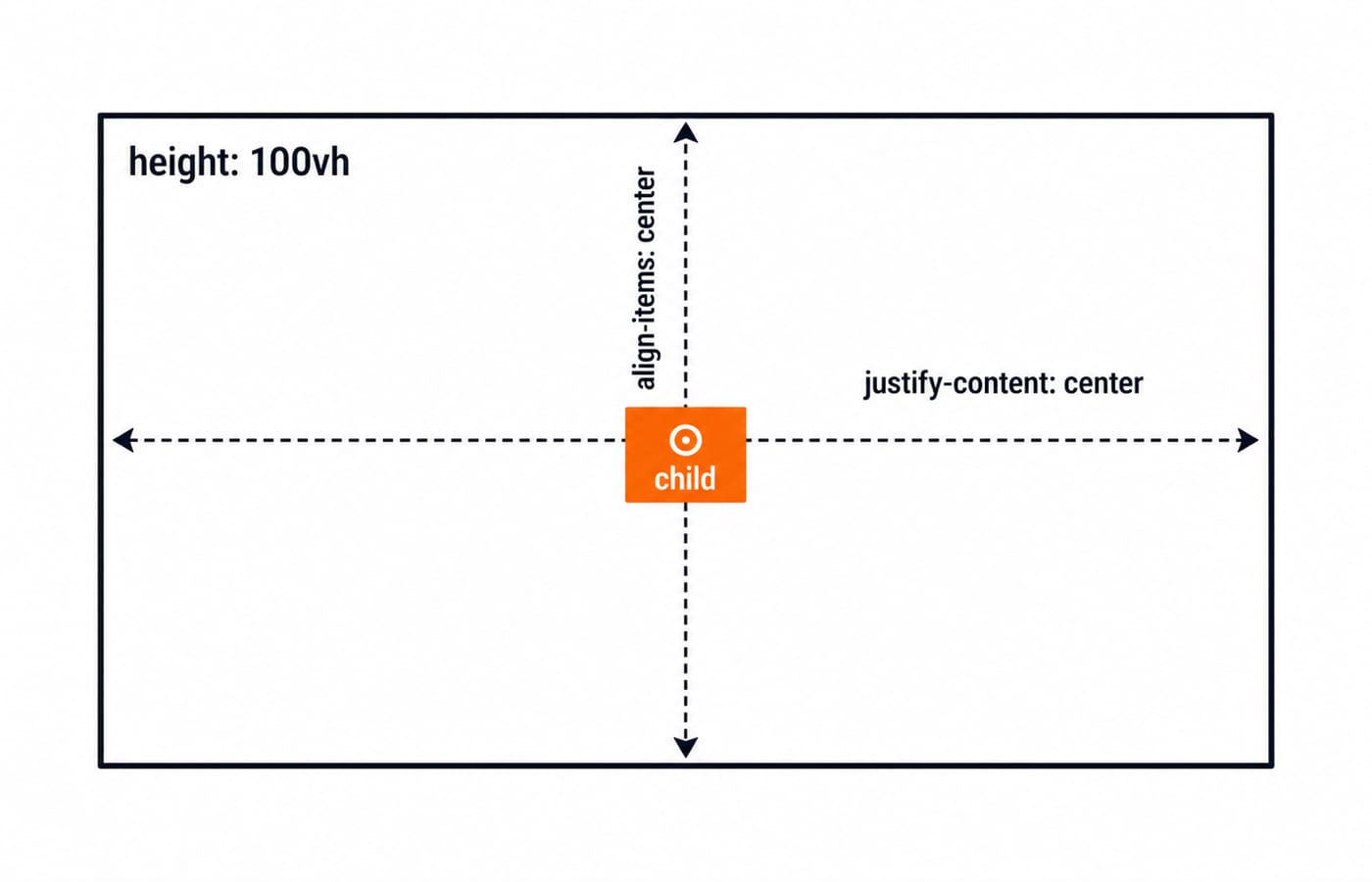
To centre a child horizontally and vertically with flexbox:
.parent {
  display: flex;
  justify-content: center;
  align-items: center;
  height: 100vh;
}
With the default flex-direction: row, the main axis is horizontal, so justify-content centres horizontally. The cross axis is vertical, so align-items centres vertically. If you change the direction to column, those visual directions swap.
Grid gives a compact alternative:
.parent {
  display: grid;
  place-items: center;
}
place-items sets alignment on both grid axes. The right answer depends on whether the parent is already a flex or grid container, not on which snippet is shorter.
Responsive design
Mobile-first CSS places the small-screen rules in the base stylesheet, then adds or changes layout as space becomes available:
.cards {
  display: grid;
  grid-template-columns: 1fr;
  gap: 1rem;
}

@media (min-width: 768px) {
  .cards {
    grid-template-columns: repeat(2, 1fr);
  }
}
Relative units solve different problems. rem follows the root font size, so type and spacing scale with the reader's browser setting. A percentage resolves against the containing block's matching dimension, and percentage padding and margin resolve against its width even on the top and bottom edges. Viewport units follow the viewport rather than the parent. They are tools, not a rule that every pixel value is wrong.
You can also make layouts responsive without adding many breakpoints. Flexbox can wrap items with flex-wrap: wrap. Grid can use repeat(auto-fit, minmax(...)) to create as many tracks as fit. The goal is not to collect breakpoints. It is to let content remain usable across widths.
The traps interviewers set
A later rule does not always win. It wins only when the earlier cascade criteria and specificity are tied. An absolutely positioned element uses the nearest ancestor that establishes its containing block, commonly an ancestor with non-static positioning, so forgetting position: relative on the intended parent can move the child unexpectedly.
z-index is not a global height number. A positioned element with a z-index other than auto creates a stacking context, and everything inside it is ordered only against its siblings within that context. A child at z-index: 999 therefore still sits behind a neighbouring context whose own value is 2. The other half of the old rule is wrong too: flex and grid items honour z-index while their position is still static, so check the parent's layout mode before deciding the property needs positioning.
On mobile, 100vh is measured against the large viewport, so a full-height section stays taller than the visible area while the address bar is on screen and its bottom edge is cut off. Modern viewport units such as dvh, svh and lvh let you target the dynamic, small or large viewport deliberately.
Finally, display: none removes the element from layout, while visibility: hidden preserves its layout space. Both also drop it from the accessibility tree, so neither hides something visually while keeping it available to a screen reader. That needs a visually-hidden utility which clips the element to a single pixel and leaves it rendered.
How the round tests it
Expect to compute a winning colour, explain the box model, centre a box, choose between flexbox and grid, and repair a section that breaks at a narrow width. Say your reasoning aloud. For specificity, write the tuple. For dimensions, add content, padding and border. For alignment, name the main and cross axes. For responsiveness, explain what changes when content no longer fits.
CSS is rarely the whole interview, so rehearse it beside the rounds that share the same day. The Placement Preparation category collects the aptitude, company-specific and interview-preparation courses that surround it.
Short version and next step
Count specificity as an (id, class, element) tuple. Remember that content-box adds padding outside the declared content width, while border-box includes it. Use flexbox for one-axis flow, grid for two-axis tracks, and build mobile-first styles that respond to the content.
Then practise the code instead of memorising slogans. Work through selectors, layout and responsive patterns in the Complete CSS course, and rehearse the worked specificity and centering answers until you can explain each line without guessing.
Keep learning

JavaScript Event Delegation: Bubbling, target and currentTarget with Runnable Examples
Learn how browser events travel through the DOM, then build one delegated listener that handles nested controls and rows added later.
Updated 6 Oct 20265 min readWeb Development

JavaScript Operators: Types, Precedence and Runnable Examples
Learn how JavaScript arithmetic, assignment, comparison, logical and modern operators behave by tracing one score program from inputs to final output.
Updated 2 Oct 20266 min readWeb Development

JavaScript Data Types and Coercion: Beginner Tutorial with Runnable Examples
Learn how JavaScript stores values, copies primitives and objects, converts input, compares values and produces surprising output. Trace each rule in the console.
Updated 27 Sep 20265 min readWeb Development

JavaScript Conditionals and Loops: Beginner Tutorial with Runnable Examples
Learn how JavaScript chooses a branch and repeats work. Build from small syntax examples to a complete score classifier with a traced average.
Updated 25 Sep 20265 min readWeb Development