CSS Box Model, Positioning and z-index Explained with Worked Layout Examples
Calculate a CSS box's real width, choose the right position value, and trace z-index with exact numbers. The examples turn common layout bugs into rules.
KnowledgeGate Team
Exam prep & CS education
Updated 22 Jul 20266 min read

Two CSS problems cause a large share of layout confusion: a box becomes wider than its declared width, or an element refuses to appear above another. Both behaviours follow exact rules. A 300px box with 20px of padding and a 5px border renders at 350px or at 300px depending on a single declaration, and a z-index of 9999 loses to a 2 whenever the two elements sit in different stacking contexts.
The CSS box model: content, padding, border, margin
Every visible element is four nested layers. Content sits at the centre. Padding adds space around the content, border surrounds the padding, and margin adds transparent space outside the border.
Use this exact box:
.card {
  width: 300px;
  padding: 20px;
  border: 5px solid;
  margin: 10px;
  box-sizing: content-box;
}
With content-box, the declared width applies only to the content. There are 20px of padding and 5px of border on both the left and the right. The rendered border-box width is:
300 + (2 x 20) + (2 x 5)
= 300 + 40 + 10
= 350px
Margin is outside that rendered box. Adding 10px on each side means the element occupies 350 + 20 = 370px of horizontal space, although its own rendered box remains 350px wide.
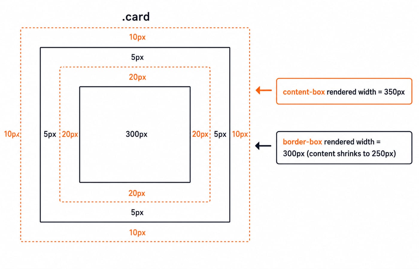
box-sizing: content-box vs border-box
Change only one declaration:
.card {
  width: 300px;
  padding: 20px;
  border: 5px solid;
  box-sizing: border-box;
}
Now 300px includes content, horizontal padding, and horizontal border. The browser must shrink the content area:
300 - (2 x 20) - (2 x 5)
= 300 - 40 - 10
= 250px
The rendered box is exactly 300px, while its content is 250px wide. The contrast worth memorising is simple: the same width: 300px produces a 350px rendered box under content-box and a 300px rendered box under border-box.
A common project-wide rule is *, *::before, *::after { box-sizing: border-box; }. It makes declared widths easier to reason about because padding and border stay inside them. The Complete CSS course lets you see this difference in a live layout instead of treating it as arithmetic alone.
CSS positioning: static, relative, absolute, fixed, sticky
The position property decides whether an element stays in normal flow and what its offsets mean.
static: the default. The element remains in normal flow, andtop,right,bottom, andleftdo not reposition it.relative: the element keeps its original place in normal flow, but offsets move its visual box from that place. The reserved space does not move with it.absolute: the element is removed from normal flow. It is positioned against its nearest ancestor whosepositionis notstatic. Without one it falls back to the initial containing block, a viewport-sized rectangle anchored at the top of the document, so the child lands at a page corner instead of the card corner.fixed: the element is positioned relative to the viewport and stays put while the page scrolls. The exception is worth knowing: if an ancestor carries atransform,filterorperspective, that ancestor becomes the containing block and the element scrolls away with it.sticky: the element behaves like a relatively positioned element until the offset you declare, saytop: 0, meets the edge of its scrolling container, then stays pinned there until that container scrolls past.
Consider an icon that must sit at the top-right of a card:
.card {
  position: relative;
}

.close-button {
  position: absolute;
  top: 0;
  right: 0;
}
The .card becomes the positioned ancestor, so top: 0 and right: 0 refer to its padding box. Remove position: relative from the card and the button may jump to a distant ancestor or the page corner. The markup has to give you a wrapper worth making relative in the first place, and those card and header patterns are covered in Complete HTML.
z-index and stacking contexts, with a worked stack
Suppose three positioned boxes overlap:
.a { position: relative; z-index: 1; }
.b { position: relative; z-index: 3; }
.c { position: relative; z-index: 2; }
Compare the numeric values. Box .b has 3, so it is in front. Box .c has 2, so it comes next. Box .a has 1, so it is at the back. The front-to-back order is therefore b, c, a.
A z-index on a static element is ignored, with one exception worth remembering: a flex or grid item obeys z-index with no position value at all. Everywhere else, set position to relative, absolute, fixed or sticky before expecting the stack shown above.
The harder rule is that z-index is not one page-wide leaderboard. It is compared inside a stacking context. A positioned element with a non-auto z-index creates one. So does opacity below 1, and so does any transform other than none, on a static element as readily as on a positioned one.
If a parent sits in a lower stacking context, its child cannot escape merely by using z-index: 9999. The child is powerful only inside that parent's context. When a huge value appears useless, inspect the ancestors before adding another zero.
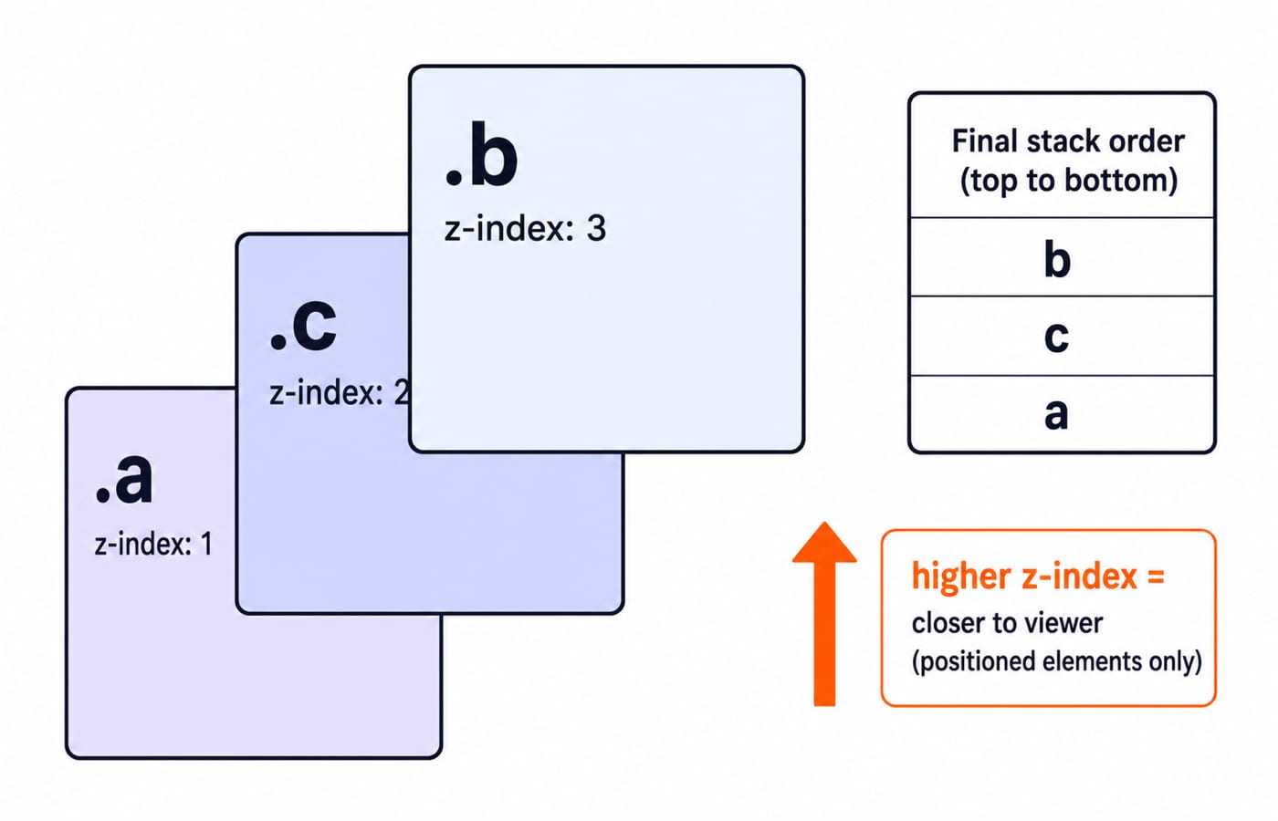
Box model, positioning, and z-index traps
These five traps explain many exam questions and real bugs:
Padding unexpectedly grows a box:
content-boxadds padding and border outside the declared width. Useborder-boxwhen the declared width should be final.Vertical margins do not add: in a normal block layout, adjoining vertical margins of
10pxand20pxcollapse to20px, the larger of the two, not30px. Horizontal margins do not collapse.A bare z-index appears inactive: on a static block that is not a flex or grid item,
z-indexdoes nothing at all. Setposition: relativefirst, then look at which ancestor opened the stacking context.An absolute child jumps away: it uses the nearest non-static ancestor. Make the intended wrapper
position: relative.A percentage width seems surprising: it resolves against the containing block, not the viewport.
width: 50%inside a600pxparent is300px, however wide the window gets.
Flexbox and Grid answer a different question: how children are distributed along an axis. They repeal none of this. A flex item still resolves its own width through box-sizing, and it obeys z-index without a position value, so the stacking rules follow it into the new layout system.
How exams and interviews test CSS layout
A typical width question gives width, padding, border, and box-sizing, then asks for the rendered result. Write the formula before substituting values. A positioning question asks which ancestor controls an absolute child. A stacking question asks you to order overlapping elements or explain why a large z-index remains trapped.
One rule sits upstream of all this arithmetic. When two declarations set the same width, specificity decides which one applies, and source order only breaks a tie that specificity leaves open. CSS specificity and the cascade works those conflicts out in full, and the Coding & Skills collection puts both posts alongside the rest of the frontend track.
The short version and your next step
Under content-box, this card renders at 300 + 40 + 10 = 350px; under border-box, it renders at 300px and the content shrinks to 250px. For the positioned stack, 3 > 2 > 1, so the order is b, c, a, but each value still lives inside its stacking context.
Rebuild both examples in a small page. Change one number at a time, predict the new width or stack order on paper, and then inspect the result in the browser. That habit turns layout from trial and error into calculation.
Keep learning

Computer Networks Hardware Basics: Devices, Domains and Worked Examples
Learn what hubs, switches, routers, gateways and access points actually do, then count network domains and trace frames through a two-LAN topology.
Updated 6 Oct 20266 min readComputer Networks

Data Link Layer Framing Explained: Byte Stuffing, Bit Stuffing and a Cross-Concept Numerical
Frame one four-byte payload in two ways, decode it, and then reuse the verified frame sizes in link-load and Stop-and-Wait calculations.
Updated 1 Oct 20266 min readComputer Networks

Byte Stuffing in Computer Networks: Worked Framing Example and Exam Traps
Learn a precise byte-stuffing convention, trace a payload containing both FLAG and ESC, reverse it safely, and calculate frame overhead and transmission time.
Updated 26 Sep 20266 min readComputer Networks

Go-Back-N Protocol Explained: Sliding Windows, Worked Numericals and Exam Traps
Trace Go-Back-N through a lost frame, calculate its legal window and link utilisation, and avoid the ACK and wrap-around traps that spoil numericals.
Updated 24 Sep 20266 min readComputer Networks