

Web Design Basics: HTML, CSS, a Worked Responsive Page and Exam Traps
Build a three-card revision page, resolve its CSS cascade and calculate every card width at three viewports. Then use five compact traps to test the same ideas.
KnowledgeGate Team
Exam prep & CS education
Updated 19 Nov 20266 min read
HTML, CSS and JavaScript are often memorised as three definitions, but a question or practical task usually asks what each layer changes and how the final page gets its size, order and behaviour. The worked revision-card page uses semantic HTML, resolves its CSS cascade and calculates its layout at three viewport widths. The Free Courses for GATE, Placements & CS category is a broader learning hub if you want to explore related foundations.
1. Web design basics: structure, presentation and behaviour
Web design plans a page's information hierarchy, visual presentation, navigation and response across screen sizes. Design and implementation differ, but their boundary is not absolute. A three-card-row design decision becomes HTML structure and CSS layout when coded.
layer | job | example from the worked page |
|---|---|---|
HTML | supplies structure and meaning | the heading, three topic cards and links |
CSS | controls presentation and layout | the grid, spacing, border and colour |
JavaScript | adds genuine interaction | filtering the cards, if that feature is added |
JavaScript is not needed merely to make an ordinary link work. Four checks matter here: content has a logical reading order, related items align consistently, spacing values are reused, and the layout still works when the viewport narrows. They are design-specific checks, not universal numerical standards.
2. Semantic HTML gives the page structure before styling
<main class="catalog">
  <h1>CS Revision Cards</h1>
  <section class="course-grid" aria-label="Revision topics">
    <article class="course-card" id="featured">
      <span class="card-label">Featured topic</span>
      <h2>Computer Networks</h2>
      <p>DNS, TCP and HTTP</p>
      <a href="#dbms">Next: DBMS</a>
    </article>
    <article class="course-card" id="dbms">
      <h2>DBMS</h2>
      <p>SQL, keys and normalisation</p>
      <a href="#os">Next: Operating Systems</a>
    </article>
    <article class="course-card" id="os">
      <h2>Operating Systems</h2>
      <p>Processes, scheduling and memory</p>
      <a href="#featured">Back to Computer Networks</a>
    </article>
  </section>
</main>
Even with CSS unavailable, the main element identifies the primary content, the h1 names the page, and each h2 names an article within the labelled section. The h1 to h2 sequence preserves heading order. Each article can stand as a meaningful card, while each anchor represents navigation to a fragment. They remain useful before any visual styling. A clickable div would hide that meaning. Buttons would also be wrong here because the controls navigate rather than change in-page state. The HTML Basics: Tags, Structure and a Worked Page owns the full treatment of elements, document structure and debugging; this page uses HTML only as the semantic skeleton for the CSS cascade and responsive-width calculation.
3. CSS cascade and box model create the layout
* { box-sizing: border-box; }
.catalog { width: min(90%, 960px); margin: 32px auto; }
.course-grid { display: grid; grid-template-columns: repeat(3, 1fr); gap: 24px; }
.course-card { padding: 16px; border: 2px solid #1D4ED8; border-radius: 8px; }
.course-card h2 { color: #334155; }
#featured h2 { color: #1D4ED8; }
@media (max-width: 1000px) { .course-grid { grid-template-columns: repeat(2, 1fr); } }
@media (max-width: 640px) { .course-grid { grid-template-columns: 1fr; } }
The cascade decides which matching declaration wins. .course-card h2 has specificity 0-1-1, while #featured h2 has 1-0-1. The ID selector therefore wins under these rules, making the first heading #1D4ED8.
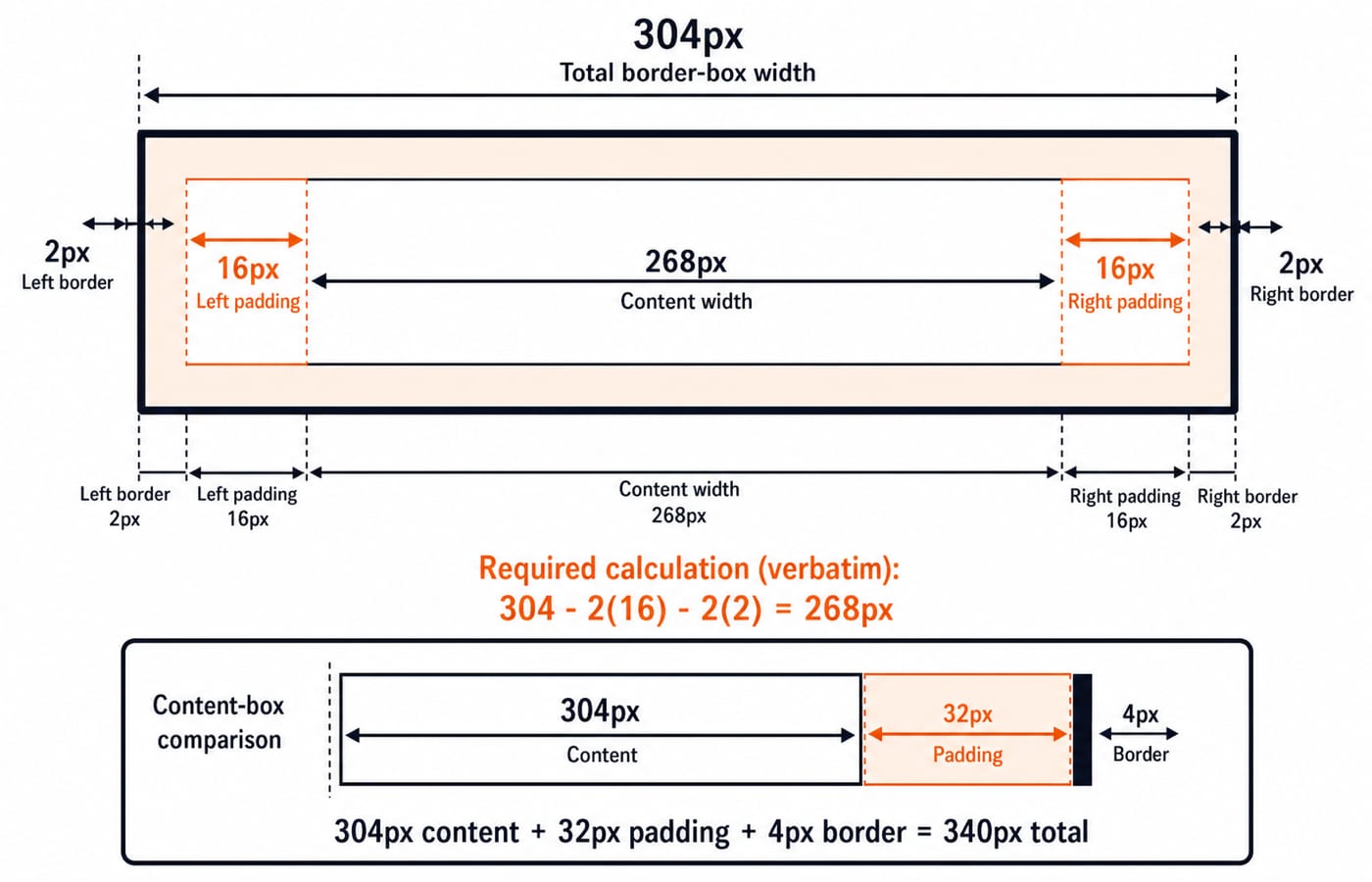
With border-box, a card's declared or grid-assigned width includes its padding and border. For the 304px wide-screen card, content width is 304 - 2(16) - 2(2) = 268px. With content-box, a declared 304px content width plus 32px padding and 4px border occupies 340px. Continue with the Complete CSS Course for more selector, cascade and layout practice.
4. Worked responsive layout at 1200px, 900px and 600px
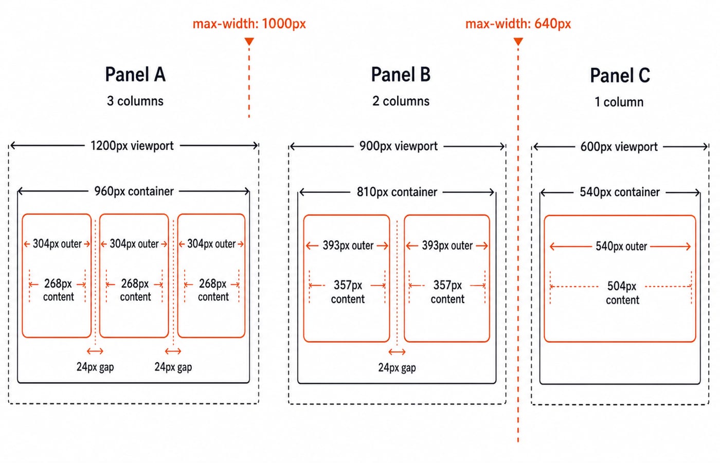
At a 1200px viewport, container width is min(0.90 x 1200, 960) = min(1080, 960) = 960px. The viewport is above 1000px, so the grid keeps three columns and has two 24px gaps. Each track is (960 - 48) / 3 = 304px. Its border-box content width is 304 - 32 - 4 = 268px.
At a 900px viewport, container width is 0.90 x 900 = 810px. The max-width: 1000px query applies, producing two columns with one 24px gap. Each track is (810 - 24) / 2 = 393px, and its content width is 393 - 32 - 4 = 357px.
At a 600px viewport, container width is 0.90 x 600 = 540px. Both media queries match. Their selectors have equal specificity, so the later one-column rule wins by source order. The one track is 540px, with content width 540 - 32 - 4 = 504px.
The reusable sequence is: calculate container width, determine which media queries match, subtract all gaps, divide the remainder by the column count, then subtract padding and borders only if the requested quantity is content width. The 1000px and 640px breakpoints are choices for this design, not universal standards.
5. Visual hierarchy, spacing and accessibility checks
The h1 names the page, each h2 names a card, and each paragraph explains its scope. A hypothetical spacing scale of 8px, 16px, 24px and 32px keeps choices related: the cards use 16px padding, the grid uses a 24px gap, and the catalog uses a 32px outer vertical margin. Consistency matters more than copying this exact scale into every design.
Review the same page with these checks:
Disable CSS and confirm that the reading order remains logical.
Reach every
cardlink with the keyboard.Keep link text meaningful outside its visual position.
Do not use colour alone to identify the featured card.
At
600px, confirm that long text wraps without clipping.
The visible Featured topic label in the HTML repairs the colour-only cue. It complements the blue heading or border without claiming formal accessibility conformance.
6. How the browser combines HTML, CSS and delivery
The browser first requests /index.html and parses the returned markup into a DOM. While parsing, it discovers /styles.css, requests that resource and builds styling information. It then combines structure and style to calculate layout and paint the page. If /app.js is present, JavaScript can attach the optional card-filter behaviour.
HTML does not "send" CSS, and CSS does not fetch a database. The HTML names resources, the browser requests them, CSS supplies presentation rules, and JavaScript can add behaviour. For the broader chain from URLs and protocols to browsers and web services, read Internet and Web Technology: How Websites, Browsers, and Web Services Actually Work; it owns that system-level path, while this section stops at the browser's markup-to-pixels work. Internet Fundamentals: DNS, URLs and Worked Examples covers DNS, URLs and transport from the network side. Protocol versions and delivery paths can vary.
7. Five answerable web design exam traps
Practice questions typically ask you to identify a layer, choose semantic markup, calculate box dimensions, resolve specificity or evaluate media-query output.
prompt | answer | trap |
|---|---|---|
| total is | forgetting both sides |
| total is | adding padding outside the declared width |
|
| counting selector length instead of specificity |
main example at a | two | forgetting the |
main example at | the later one-column rule wins because both matching rules have equal specificity | stopping at the first matching query |
8. Web design basics: the short version and next step
Write meaningful HTML first. Apply CSS with the cascade and box model in mind. Calculate the container before the columns, change the arrangement when content needs it, and add JavaScript only for behaviour.
Now try 760px without looking back: container = 0.90 x 760 = 684px; two-column track = (684 - 24) / 2 = 330px; content width = 330 - 32 - 4 = 294px. If that result was not immediate, redo the 1200px and 900px cases, then change one breakpoint and predict the new column count before opening DevTools.
Go deeper with the full courseGATE Guidance by Sanchit Sir
Keep learning

Web Design and Development Explained: How a Web Page Loads, HTML, CSS, JS and HTTP
Follow one web page from its URL to the server and back. See how HTML, CSS, JavaScript, HTTP and the database work as one connected system.
Updated 31 Oct 20265 min readGATE Strategy & Roadmap

Web Technologies Explained: HTML, CSS, JavaScript and HTTP with Worked Examples
Connect HTML, CSS, JavaScript, DNS and HTTP by following one result page from its URL to its final DOM state after two button clicks.
Updated 20 Nov 20266 min readWeb Development

CSS Interview Questions 2026: Selectors, Layout and Responsive Design with Visual Answers
Prepare the CSS questions freshers repeatedly face, with calculated specificity, box-model arithmetic, centering patterns and responsive-layout decisions.
Updated 11 Aug 20266 min read262 viewsWeb Development
HTML Basics: Complete Guide to Tags, Structure and a Worked Web Page
Learn what HTML elements mean, how a valid document fits together, and how to build and audit a complete profile page with fixed, traceable markup.
Updated 29 Jul 20266 min readProgramming Languages Survey