CSS Flexbox vs Grid: When to Use Each, with Real Layouts Solved Both Ways
Choose Flexbox or Grid from the dimensions of the job, not habit. See the same 1000px card layout solved both ways, then build a named page grid.
KnowledgeGate Team
Exam prep & CS education
Updated 4 Aug 20266 min read
Most people choose Flexbox or Grid by habit and then fight the layout model they picked. The decision is not a matter of taste. Flexbox controls one axis at a time, while Grid controls rows and columns together. Give both models the same job, four cards in a 1000px row, and they agree on the first three widths, then split: Flexbox stretches the leftover fourth card to the full 1000px while Grid holds it in a 322.67px column.
The one-line Flexbox vs Grid rule
Flexbox is one-dimensional. It arranges items along a main axis, either a row or a column, and then aligns them across the other axis. It is usually content-driven: the items and their sizes influence how the line is distributed.
Grid is two-dimensional. It defines row and column tracks together, then places items into that structure. It is usually layout-driven: the container establishes a framework, and the items occupy its cells or named areas.
Keep this practical heuristic:
Use Flexbox for a navigation bar, toolbar, button row, centred panel, or vertical stack.
Use Grid for a card matrix, dashboard, gallery, or page skeleton where rows and columns must align.
They are not competitors that cannot mix. A page can use Grid for its large regions and Flexbox inside the header to align its logo and controls.
Flexbox essentials that do the real work
display: flex establishes a flex formatting context. flex-direction chooses the main axis. With the default row, justify-content distributes space horizontally along that main axis, while align-items aligns items vertically on the cross axis. Change to column, and those roles rotate with the axes.
The item shorthand flex: grow shrink basis controls how width is negotiated. For example:
.card {
  flex: 1 1 300px;
}
This says to start from a 300px basis, allow the card to grow when its line has free space, and allow it to shrink when necessary. flex-wrap: wrap permits another line, while gap adds consistent spacing between items without margin calculations.
Flexbox distributes free space independently on each flex line. That per-line accounting is why a single wrapped card can end up much wider than the cards sitting above it.
Grid essentials for explicit tracks
Grid starts with track definitions:
.cards {
  display: grid;
  grid-template-columns: repeat(auto-fill, minmax(300px, 1fr));
  gap: 16px;
}
minmax(300px, 1fr) prevents a column from becoming narrower than 300px and allows it to share remaining space. repeat(auto-fill, ...) creates as many such tracks as fit. The fr unit divides free space after fixed sizes and gaps have been accounted for.
gap works across both axes. For a larger layout, grid-template-areas gives regions readable names rather than making every element depend on line numbers.
One distinction matters in responsive grids. auto-fill retains empty tracks that fit in the container. auto-fit collapses empty tracks, allowing occupied tracks to expand into that space. Their results match when every track is occupied, but can differ when there are fewer items than available columns.
Worked course-card row solved both ways
Assume a container exactly 1000px wide, a 16px gap, four cards, and a minimum card width of 300px.
Flexbox solution
.cards {
  display: flex;
  flex-wrap: wrap;
  gap: 16px;
}

.card {
  flex: 1 1 300px;
}
Can three minimum-width cards fit on one line?
card widths = 3 x 300 = 900px
gaps        = 2 x 16  = 32px
total       = 900 + 32 = 932px
Yes, because 932px is within 1000px. Four cannot fit because 4 x 300 + 3 x 16 = 1200 + 48 = 1248px.
The first line has 1000 - 932 = 68px of free space. Three cards have equal growth factors, so each receives 68 / 3 = 22.67px. Each card becomes approximately 300 + 22.67 = 322.67px wide.
The fourth card wraps onto a new flex line. It is the only growing item on that line, so it takes all the available width and becomes 1000px wide. Flexbox aligns and distributes each line independently.
Grid solution
.cards {
  display: grid;
  grid-template-columns: repeat(auto-fill, minmax(300px, 1fr));
  gap: 16px;
}
Grid also fits three columns because their minimum widths plus two gaps require 932px. It establishes three shared column tracks. After subtracting the gaps, the width available to tracks is:
1000 - (2 x 16) = 968px
968 / 3 = 322.67px per track
The fourth card goes into column 1 of row 2 and stays approximately 322.67px wide. Columns 2 and 3 on that row remain empty, but the column structure still aligns with row 1.
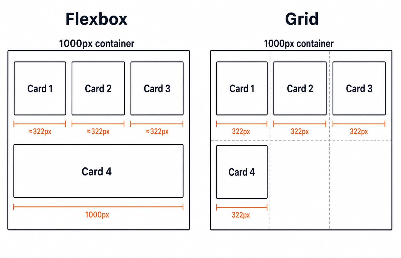
Flexbox lets the last item fill its own line, while Grid preserves a strict column. If the design needs card edges aligned across rows, Grid expresses that requirement directly.
When Grid clearly wins: a page skeleton
Suppose a page needs a header and footer spanning its full width, plus a fixed 240px sidebar beside flexible main content.
.page {
  display: grid;
  grid-template-columns: 240px 1fr;
  grid-template-rows: auto 1fr auto;
  grid-template-areas:
    "header  header"
    "sidebar main"
    "footer  footer";
}

.header  { grid-area: header; }
.sidebar { grid-area: sidebar; }
.main    { grid-area: main; }
.footer  { grid-area: footer; }
The container describes both dimensions in one place. The middle row has a 240px track and a flexible track; the first and last rows span both columns through their repeated area names.
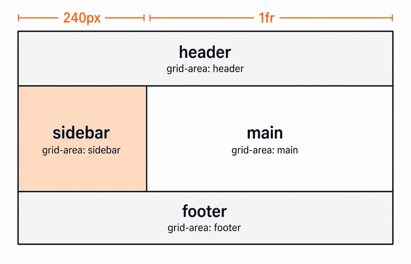
The same skeleton in Flexbox needs two nested containers, one for each axis:
.page {
  display: flex;
  flex-direction: column;
  min-height: 100vh;
}

.middle {
  display: flex;
  flex: 1;
}

.sidebar { flex: 0 0 240px; }
.main    { flex: 1 1 auto; min-width: 0; }
The widths land in the same place: the sidebar is pinned at 240px and main takes whatever the container has left. The cost is structural. You need a .middle wrapper whose only job is to hold the horizontal axis, the region names live in class names instead of one readable grid-template-areas block, and min-width: 0 is mandatory on .main, because a wide table or a long code line inside it would otherwise raise its automatic minimum size and push the whole row past the container width. Grid states both axes in one declaration block, which is why page skeletons read better as Grid.
Traps that make either layout feel broken
Forcing wrapped Flexbox lines to behave like shared Grid columns leads to alignment fights.
A flex child with long unbreakable content may refuse to shrink. Add
min-width: 0where the item must become narrower than its content's intrinsic width.auto-fitcollapses empty tracks. With few items, this can make one grid item stretch much wider than expected.Percentage gaps participate in sizing differently from simple pixel gaps and can make mental arithmetic misleading.
Using both Grid and Flexbox at the same level without a clear responsibility makes debugging harder. Give each layout model a specific job.
Layout sits on top of markup, so the HTML interview questions for freshers are worth a pass for semantic structure, and the React interview questions for freshers show where layout choices meet component boundaries.
The short version and your next step
Use Flexbox when one axis carries the layout. Use Grid when rows and columns must coordinate. In the 1000px example, both produce three cards of about 322.67px on the first row, but Flexbox stretches the lone second-row card to 1000px while Grid keeps it in a 322.67px column.
Build both versions in the Complete CSS course, then place them inside a larger project through the MERN Stack and DSA bundle. After the boxes are in the right places, CSS specificity and the cascade decides which of your competing rules actually paints them.
Keep learning

JavaScript Event Delegation: Bubbling, target and currentTarget with Runnable Examples
Learn how browser events travel through the DOM, then build one delegated listener that handles nested controls and rows added later.
Updated 6 Oct 20265 min readWeb Development

JavaScript Operators: Types, Precedence and Runnable Examples
Learn how JavaScript arithmetic, assignment, comparison, logical and modern operators behave by tracing one score program from inputs to final output.
Updated 2 Oct 20266 min readWeb Development

JavaScript Data Types and Coercion: Beginner Tutorial with Runnable Examples
Learn how JavaScript stores values, copies primitives and objects, converts input, compares values and produces surprising output. Trace each rule in the console.
Updated 27 Sep 20265 min readWeb Development

JavaScript Conditionals and Loops: Beginner Tutorial with Runnable Examples
Learn how JavaScript chooses a branch and repeats work. Build from small syntax examples to a complete score classifier with a traced average.
Updated 25 Sep 20265 min readWeb Development