The following figure shows the data of students enrolled in 5 years (2014 to…
GATE · 2020 · AE · General Aptitude
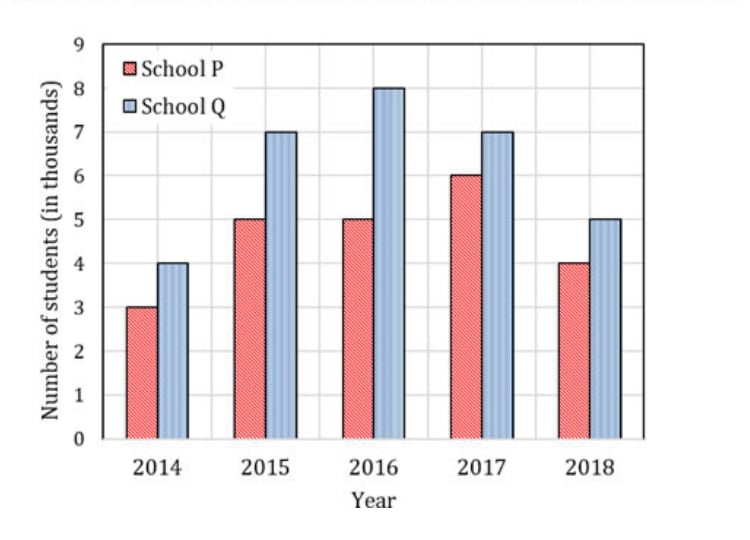
The following figure shows the data of students enrolled in 5 years (2014 to 2018) for two schools P and Q. During this period, the ratio of the average number of the students enrolled in school P to the average of the difference of the number of students enrolled in schools P and Q is _____.
- A.
8 : 23
- B.
23 : 8
- C.
23 : 31
- D.
31 : 23
Attempted by 1 students.
Sign up free to check your answer
Sign up freeLoading lesson…