User Interface Analysis and Design Steps: Worked Library Kiosk Example
Follow one constructed college-library kiosk from user and task analysis to screen flows, error recovery and a measured prototype revision.
KnowledgeGate Team
Exam prep & CS education
Updated 20 Sep 20266 min read
Many learners can recite consistency, feedback and error prevention, but still jump straight from a problem statement to drawing screens. Interface design instead follows a traceable sequence from users, tasks and context to requirements, task flows, screens, prototypes and evaluation. For a college-library kiosk, five tasks are prioritised before the Borrow flow is mapped through failure states; two usability-test rounds then drive a measurable revision.
Treat the kiosk hardware, the 1 to 5 priority scales, the 60-second target and the usability timings as practice inputs, not measurements from a real library.
Interface analysis comes before interface design
Interface analysis identifies users, goals, tasks, required information and context. Interface design translates those findings into navigation, controls, states, feedback and recovery. Evaluation checks choices against original tasks, making the sequence iterative. Software Engineering for CS Teaching Exams covers the broader lifecycle from requirements through testing; UI analysis focuses specifically on user needs, task flows, controls, feedback and recovery.
The kiosk has a 10-inch, 1280 x 800 touch display, a barcode scanner and no physical keyboard. Users include a frequent student who knows the flow, a first-time student needing visible instructions, and a librarian handling blocked accounts and damaged barcodes. The target is an ordinary borrow or return within 60 seconds, with explicit confirmation for destructive or account-changing actions.
Context includes standing use, short sessions, queue pressure, barcode input, shared-screen privacy and recovery without losing valid scans. The NET Courses and Test Series lists wider preparation routes for the surrounding syllabus.
Convert users and tasks into testable requirements
Score each task 1 to 5 for frequency and 1 to 5 for consequence if it fails, then multiply the two to rank them.
Task | Frequency | Consequence | Priority calculation |
|---|---|---|---|
Borrow | 5 | 5 | 5 x 5 = 25 |
Return | 4 | 4 | 4 x 4 = 16 |
Renew | 3 | 3 | 3 x 3 = 9 |
Pay fine | 1 | 5 | 1 x 5 = 5 |
Search catalogue | 2 | 2 | 2 x 2 = 4 |
Borrow, Return and Renew get direct actions as the three highest scores. Search is secondary. Pay fine remains: a blocked attempt must explain the account state and route the user to the librarian because consequence matters.
Make vague qualities observable. Clear means a first-time user identifies the next action without staff help. Fast means the 60-second target. Recoverable means correcting a bad scan without losing valid ones. Private means showing STU-2048 as STU-20•• and clearing after 8 seconds.
Design the information architecture and main task flow
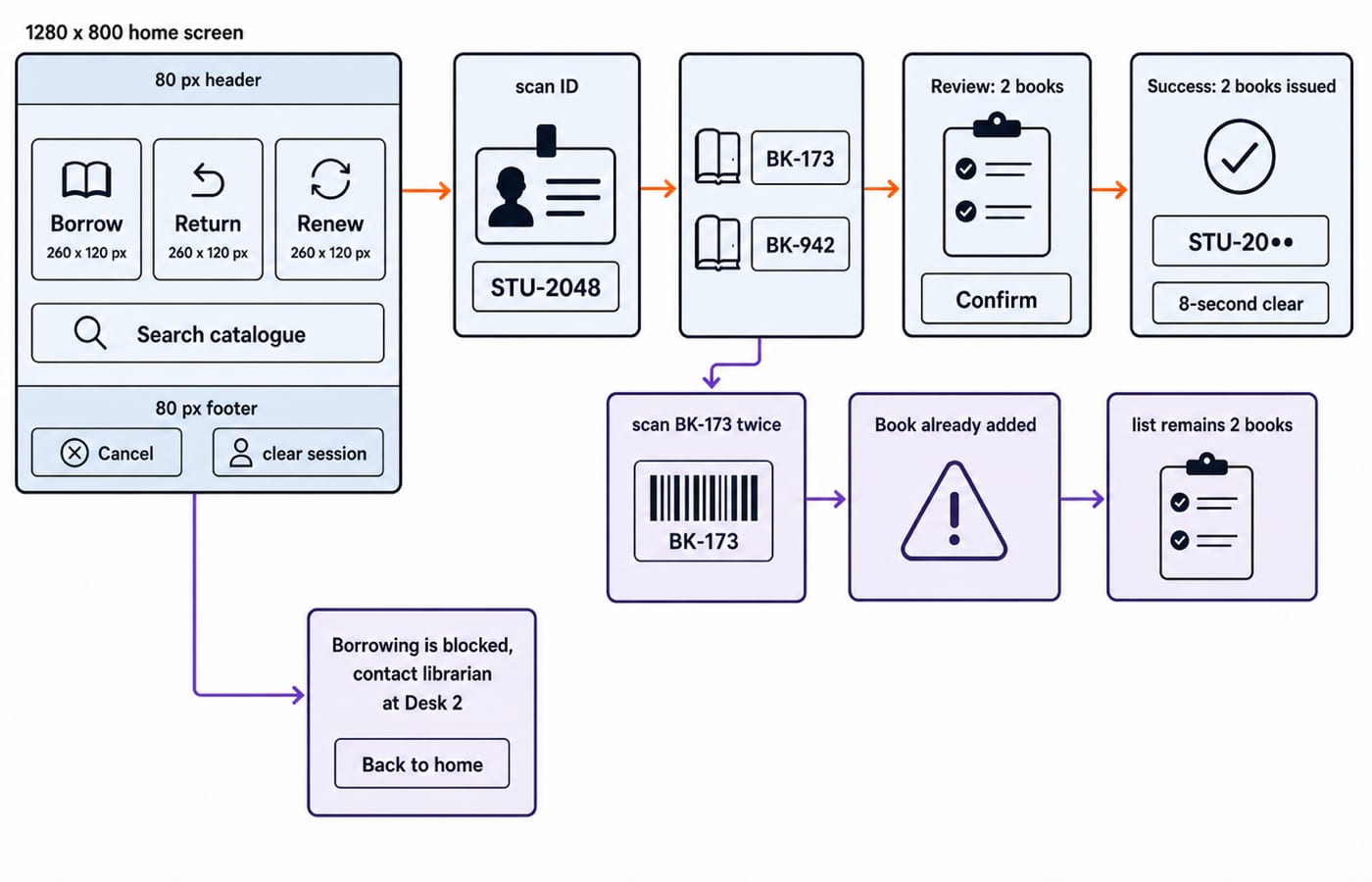
The home screen has an 80 px top bar with Library self-service, language and Help. A primary row has three 260 x 120 px buttons: Borrow, Return and Renew. Search catalogue sits below. An 80 px footer separates Cancel and clear session from confirmation controls. Hierarchy follows task priority, not alphabetical order.
The Borrow flow is: Home -> Borrow -> scan STU-2048 -> scan BK-173 -> scan BK-942 -> Review, 2 books -> Confirm -> Success, 2 books issued. Before confirmation, Back is available and a retry preserves both valid books. Confirm is necessary because issuing changes the account state.
A duplicate BK-173 gives Book already added and leaves 2 books, not 3. A blocked account gives Borrowing is blocked. Please contact the librarian at Desk 2, offers Back to home, and clears private details after 8 seconds. Flows must cover errors, cancellation and recovery as well as success.
Apply interface principles to controls, feedback and errors
Visibility appears as Step 2 of 3: Scan books. Consistency keeps Back lower-left and Confirm lower-right. Mapping puts the on-screen scan zone beside the scanner. Feedback lists each valid ID and announces 1 book added or 2 books added. User control keeps Back and Cancel before confirmation.
Keep prevention, detection and recovery distinct. Prevention disables Confirm at 0 books and masks STU-2048 as STU-20••. Detection identifies an unreadable barcode or duplicate BK-173. Recovery offers Try again, Remove and Ask librarian while preserving valid entries. An error must say what happened and what to do next, not just Invalid input.
Interface analysis finds user, task and context needs. Information architecture groups content. Interaction design defines actions and states. Visual design controls appearance and emphasis. Prototyping creates a testable representation. Usability evaluation supplies evidence for revision. One artefact may support several activities.
Prototype, test, calculate and iterate
Paper or greyscale wireframes test labels, order and navigation cheaply. An interactive prototype tests scanning, disabled states, timing, masking and the 8-second clear. Higher visual fidelity does not guarantee usability, and a prototype is not the finished product.
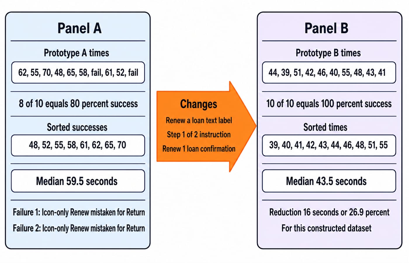
In round A, five participants attempt Borrow once and Renew once, giving 5 x 2 = 10 attempts. Times are 62, 55, 70, 48, 65, 58, fail, 61, 52, fail seconds. Eight succeed, so the success rate is 8 / 10 x 100 = 80%. The successful times sort to 48, 52, 55, 58, 61, 62, 65, 70. With eight values, the median is the mean of the fourth and fifth: (58 + 61) / 2 = 59.5 seconds. Both Renew failures occur because users mistake an icon-only control for Return.
The revision replaces the icon with Renew a loan, adds Step 1 of 2: Scan student ID, and asks Renew 1 loan? before confirmation. Round B records 44, 39, 51, 42, 46, 40, 55, 48, 43, 41 seconds, with no failures. Success is 10 / 10 x 100 = 100%. Sorted times are 39, 40, 41, 42, 43, 44, 46, 48, 51, 55, giving median (43 + 44) / 2 = 43.5 seconds. The reduction is 59.5 - 43.5 = 16 seconds; proportionally, 16 / 59.5 x 100 = 26.89%, or about 26.9%.
All ten Prototype B attempts meet the 60-second target, fixing the label problem. A tiny classroom dataset does not prove universal usability. Record the issue, change, metric and uncertainty, then test relevant users and edge cases again.
Common interface analysis and design traps
Drawing screens first: the result follows the designer's sequence. Start with users, goals, context, tasks and exceptions.
Writing
simpleoruser-friendly: those labels are untestable. Use the 60-second target, 8-second clear and scan recovery.Designing only success: duplicate or unreadable scans, blocked accounts and cancellation become dead ends. Specify recovery.
Treating consistency as identical screens: keep meanings predictable, but retain necessary confirmation. Fewer clicks do not prove usability.
Calling one round validation: two Renew failures justify a label change, not a universal claim.
How questions test UI analysis and design
Questions may order analysis through evaluation, match findings to requirements, identify a violated principle, complete a state diagram, or calculate completion rate or median time.
Use this six-step answer routine:
Identify users.
List goals and tasks.
Record context and constraints.
Convert findings into testable requirements.
Design flows, states and screens.
Prototype, measure and iterate.
For the broader lifecycle and testing map, use the IBPS SO IT Officer Software Engineering Professional Knowledge Guide guide; the kiosk problem isolates user and task analysis, interface flow, recovery states and usability measurement.
The short version
Analyse people, tasks and context before choosing controls. Make requirements observable, draw success and recovery paths, test a prototype with real tasks, and revise from evidence. For structured subject teaching, use the NTA-UGC-NET Paper 2 Complete Course. When you are ready for timed practice, use the NTA UGC NET Paper 2 Test Series.
Now redraw the STU-2048 Borrow flow and recompute 80%, 59.5 seconds, 100% and 43.5 seconds without looking back.
Keep learning

ICT in Education MCQs: 12 Solved Questions on Digital Learning Tools
Solve 12 ICT in Education MCQs, then use clear explanations and a five-layer model to separate files, tools, platforms and public initiatives.
Updated 3 Oct 20268 min readUGC NET Computer Science
Requirements Elicitation Techniques and Use Case Development: Worked Library Example
Follow a fictional library reservation from interviews and observation through testable requirements, a UML use-case model, UC-07, and acceptance checks.
Updated 28 Sep 20266 min readUGC NET Computer Science

Quality Factors: McCall’s and ISO 9126 Models with a Worked Scoring Example
Build both quality models around one maintainability audit. This guide maps their vocabulary, calculates McCall-style and ISO-style scores, and ends with exam-focused checks.
Updated 25 Sep 20265 min readUGC NET Computer Science

Cohesion and Coupling MCQs: 10 Solved Questions on Functional Independence
Practise 10 solved MCQs on cohesion, coupling, functional independence, module dependencies, and the distinctions that make closely matched options easier to separate.
Updated 24 Sep 20267 min readUGC NET Computer Science