Analyse the graph/s given below and answer the question that follows. The…
2023
Analyse the graph/s given below and answer the question that follows. The following graph presents data on the Indian Automobile Industry in various segments. (All figures are in '000s).
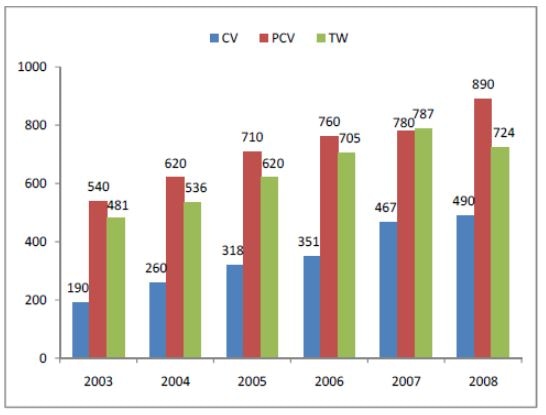
During which year the sale of TWs was more than the sales of PCVs in terms of percentage of the automobile industry?
Answer: B. 2007 — In a grouped bar chart, each series' bar for a given year is an independent value for that year. To find where one series exceeds another, compare the two…
- A.
2008
- B.
2007
- C.
2006
- D.
None of these
Attempted by 5 students.
Show answer & explanation
Correct answer: B
In a grouped bar chart, each series' bar for a given year is an independent value for that year. To find where one series exceeds another, compare the two bars year by year at the same year position, rather than looking at overall trends across years.
Reading the PCV and TW figures for each year from the chart:
Year | PCV (in '000s) | TW (in '000s) |
|---|---|---|
2003 | 540 | 481 |
2004 | 620 | 536 |
2005 | 710 | 620 |
2006 | 760 | 705 |
2007 | 780 | 787 |
2008 | 890 | 724 |
Comparing the two columns year by year, TW is greater than PCV only in 2007 (787 > 780); in every other year shown, PCV is the higher value.
Cross-check: since the total automobile industry figure for a given year is the same base for both segments, comparing the raw '000s values year by year is equivalent to comparing each segment's percentage share of that year's total — so 2007 is also the year where TW's percentage share of the industry exceeds PCV's percentage share.
Hence, the sale of TWs exceeded the sale of PCVs during 2007.