A bar chart can look easy until the question mixes two series, hides a segment inside a stack, or asks for percentage change with an easy-to-miss base. The solution is not faster calculation. It is a fixed reading order that prevents the wrong values from entering your calculation. Build that aptitude foundation, then use the same process for placement aptitude and bank-exam data interpretation. It keeps the method stable even when the chart's context changes.
Read the chart before reading the question
Scan every chart in this order:
Read the chart title.
Identify the horizontal categories.
Identify the vertical measure.
Note the unit or multiplier.
Match every colour or pattern to the legend.
The fourth step prevents unit mistakes. A bar labelled 12 on an axis in "hundreds of units" means 1,200 units. On a percentage axis, read a bar at 12 as 12%. When comparing two percentage values, subtract them for a percentage-point difference; relative change uses the earlier percentage as the denominator.
A simple chart has one bar per category. A grouped chart places bars beside one another, so compare series within the same category. A stacked chart divides each bar into components, so separate its total from its segments.
Copy only the required values, add the unit, and confirm the category and series. Arithmetic comes last.
Grouped bar chart worked example: compare two series safely
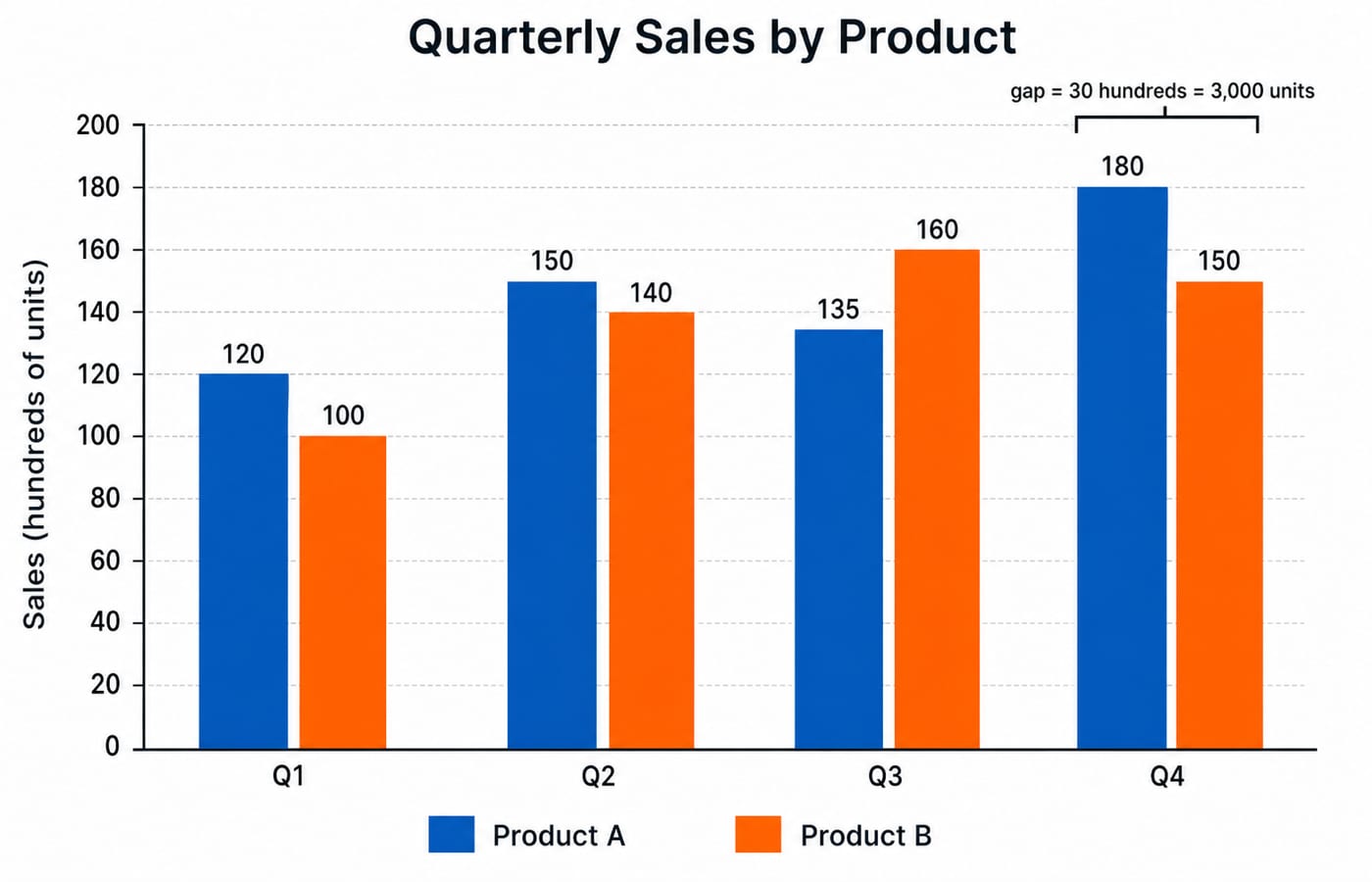
Consider "Quarterly Sales by Product", a grouped vertical chart. Its y-axis shows sales in hundreds of units from 0 to 200, in intervals of 20. Its Q1 to Q4 values are 120, 150, 135, and 180 for Product A, and 100, 140, 160, and 150 for Product B.
Question 1: In which quarter is the absolute gap largest?
Q1: |120 − 100| = 20
Q2: |150 − 140| = 10
Q3: |135 − 160| = 25
Q4: |180 − 150| = 30
The largest gap is 30 hundreds in Q4, which equals 30 × 100 = 3,000 units.
Question 2: What is Product A's percentage increase from Q1 to Q4?
Increase = 180 − 120 = 60 hundreds. The starting value is 120, so percentage increase = (60 ÷ 120) × 100 = 50%.
Question 3: What is the Q2 ratio of A to B?
A:B = 150:140. Divide both terms by 10 to get 15:14.
Question 4: Which product leads across all four quarters?
Product A total = 120 + 150 + 135 + 180 = 585 hundreds. Product B total = 100 + 140 + 160 + 150 = 550 hundreds. A leads by 585 − 550 = 35 hundreds, or 3,500 units.
Bar height locates a likely answer. Correct subtraction, ratio reduction, and percentage base decide it.
Stacked bar chart worked example: recover segments and totals
Now consider "Loan Applications by Branch and Type". Its y-axis runs from 0 to 240 in intervals of 20. Each branch is stacked as Home, Personal, and Auto.
Branch | Home | Personal | Auto | Total |
|---|---|---|---|---|
A | 80 | 50 | 30 | 160 |
B | 100 | 40 | 60 | 200 |
C | 70 | 90 | 50 | 210 |
D | 120 | 60 | 40 | 220 |
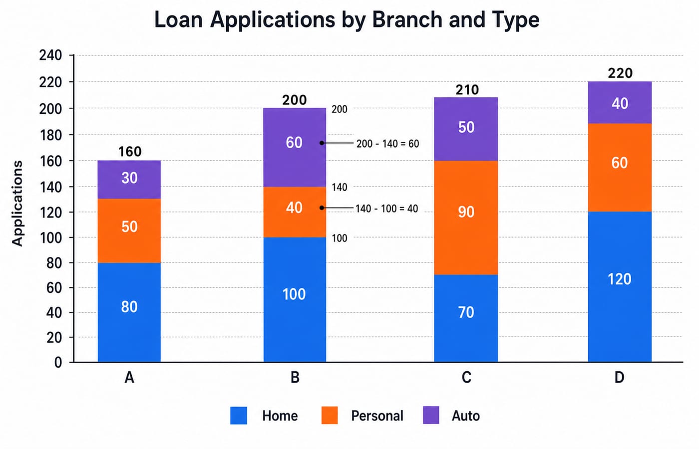
For Branch B, the cumulative boundaries are 100 after Home, 140 after Personal, and 200 at the top. Therefore Personal = 140 − 100 = 40, while Auto = 200 − 140 = 60. The top of a segment is not automatically that segment's value.
Which branch has the highest total? Branch D has 120 + 60 + 40 = 220 applications.
What share of Branch B applications is Auto? The calculation is part ÷ whole: (60 ÷ 200) × 100 = 30%.
What is the increase in total applications from Branch A to Branch D? The absolute increase is 220 − 160 = 60 applications. The relative increase uses Branch A as the base: (60 ÷ 160) × 100 = 37.5%.
Match each question phrase to the right operation
Question phrase | Operation |
|---|---|
How many more? | Larger value − smaller value |
How many times? | One value ÷ the comparison value |
Ratio | Compare in the stated order, then reduce |
Share of total | Part ÷ whole × 100 |
Percentage increase | (New − old) ÷ old × 100 |
Percentage points | Direct subtraction of two percentages |
The denominator matters. A rise from 120 to 180 is 60 ÷ 120 = 50%. Reverse it and the fall is 60 ÷ 180 = 33.33%, rounded to two decimals. The gap stays 60, but the starting value changes.
For a combined-share question, total Home applications = 80 + 100 + 70 + 120 = 370. All applications = 160 + 200 + 210 + 220 = 790. The Home share is (370 ÷ 790) × 100 = 46.84%, rounded to two decimal places.
A fast solving loop that protects accuracy
Use this loop: identify the category and series, extract two or three values, write the operation symbol, estimate the range, calculate, and restore the unit.
For the Q4 comparison, write A = 180 hundreds and B = 150 hundreds. The operation is subtraction, and the estimated gap is near 30. The exact answer is 180 − 150 = 30 hundreds = 3,000 units.
Options can sometimes reduce work. For 370 ÷ 790, simplify to 37 ÷ 79. That is slightly less than one half, so an option near 47% is plausible. Calculate precisely only when nearby options require it. Readers comparing how assessments frame aptitude can also use AMCAT, CoCubes, eLitmus: Aptitude Tests Compared.
Common bar-chart traps and how to correct them
Truncated axis: An axis beginning above zero can exaggerate differences. Trust labels and scale, not bar length alone.
Stacked endpoint error: Branch B's Personal segment ends at 140, but its value is 140 − 100 = 40. Subtract the lower boundary for any non-bottom segment.
Wrong percentage base: Divide by the old or stated comparison value. Growth from 120 to 180 is 50%, while decline from 180 to 120 is 33.33%.
Unit loss and category drift: Keep "hundreds of units" beside sales values, and trace within the same quarter or branch before comparing colours.
False precision: If a bar lies between tick marks without a label, report an approximate value. Do not invent an exact reading.
How placement and bank-exam DI can frame the same skill
Placement assessments may place the chart inside sales, hiring, production, or survey data. Banking practice may use branches, deposits, loans, or customer counts. The underlying operations remain comparison, ratio, contribution, and change.
For current question counts, timing, marking, and section structure, use the relevant conducting body's latest notification or test instructions. The IBPS PO Prelims Preparation Course provides guided preparation; the official notification remains the source for the exam's current rules.
The short version and the next practice step
Scan the title, axes, unit, and legend. Separate grouped comparisons from stacked totals. Choose the percentage base before calculating. Finally, restore the unit and check whether the result is sensible.
Practice check: using the stacked chart, what percentage of all applications are Personal loans?
Personal applications total 50 + 40 + 90 + 60 = 240. All applications total 790, so the share is (240 ÷ 790) × 100 = 30.38%, rounded to two decimals. The estimate should be slightly below one third.
Explore broader study through Aptitude Courses for Exams & Placements. For structured placement preparation, continue with the Aptitude Course for Placement.