The following graphs show the classification of appeared candidates and…
2026
The following graphs show the classification of appeared candidates and qualified candidates from different states in a competitive test. Study the graphs and answer the question below.
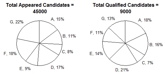
What is the ratio between the number of appeared candidates from states C and E together and the appeared candidates from states A and F together?
- A.
17 : 33
- B.
11 : 13
- C.
13 : 27
- D.
17 : 27
Attempted by 4 students.
Show answer & explanation
Correct answer: A
In a pie chart, every sector's percentage is calculated against the SAME overall total. So when comparing two groups formed by combining sectors from the same chart, the ratio of the sums of their percentages equals the ratio of their actual counts directly — there is no need to convert to absolute values first.
Applying this to the 'Total Appeared Candidates' chart, where the total is 45,000:
State C's share is 8% and State E's share is 9%; combined, C and E together account for 8% + 9% = 17%.
State A's share is 15% and State F's share is 18%; combined, A and F together account for 15% + 18% = 33%.
Since both combined percentages are taken from the same total of 45,000, the ratio between the two groups' candidate counts equals the ratio of their percentages: 17 : 33.
Cross-check with actual counts: 17% of 45,000 = 7,650 and 33% of 45,000 = 14,850. Dividing both by their HCF (450) gives 17 : 33 directly — the same ratio, confirming the result.
Hence, the ratio between the appeared candidates from states C and E together and states A and F together is 17 : 33.